Introduction
A Cloudy Mountain Plot is an informative RDI [1] categorical distribution plot inspired by Violin, Bean and Pirate Plots.
Like Violin plots [Hintze_Nelson_1998], it shows smoothed kernel density curves, revealing information which would be hidden in boxplots, for example presence of multiple “peaks” (“modes”) in the distribution “mountain”.
Like Bean plots [Kampstra_2008], it shows the raw data, drawn as a cloud of points. By default all data points are shown but you can optionally control this and limit the display to a subset of the data.
Like Pirate plots [Phillips_2017], it marks confidence intervals (either from Student’s T or as Bayesian Highest Density Intervals or as interquantile ranges) for the probable position of the true population mean.
Since by default it does not symmetrically mirror the density curves, it allows immediate comparisions of distributions side-by-side.
The present documentation introduces both what cloudy mountain plots are
and how to create them, using a plotting function (cmplot) which has been
coded in both Julia and Python, built on top of the freely available
Plotly graphic library.
Elements of the plot
(Note: check the Interactive example to see how the following figure actually looks like when you create it, with the full interactive power of plotly)
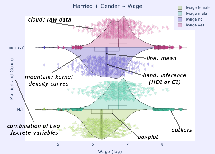
- cloud
Marker symbols show the number and location of the raw data points. They are shown jittered for clarity. It is possible to fully control both the aspect (
opacityandshapes) of the markers and theirnumber(in case showing them all would prove too slow or unelegant). It is also possiblenot to showany point. For clarity, by default the points are plotted on the opposite side of the kernel density curve. They can alternatively be plottedover the density curve, as in the above image.- mountain
Kernel density estimation curve.
- line
Indicates the mean of the distribution
- band
Probable position of the true population mean, to desired level of confidence. Method used can be
specifiedas either CI [2] , HDI [3] or IQR [4]. It is also possible not to show the band.- boxplot
A small boxplot. It can be
shown or hidden, as desired.- outliers
The outliers are marked without jitter, on the baseline, and with less transparency. It is of course possible to choose
whether to showthe outliers.
Footnotes